


Orange Mana
The Anti-Spectacle, and a Hypothesis About Why There's Really No Skyscrapers in Europe


There is often discussion of why Europe doesn’t have a lot of skyscrapers and modern buildings, where defenders of Europe will come in and say “it’s so human-scale and walkable and preserves our heritage!” I think that argument is stupid. It just sounds like you’re about the recite the Definition of Man from The Chrysalids, except it’s the Definition of Man’s Architecture, and additionally, it often segues straight into fascist-sounding hyper-traditionalist arguments. “A building shall be no more than three stories in height, and it shall be covered in 18th-century ornamentation created in the neoclassical style, and any building not formed thus is not for humans, and it is an abomination in the eyes of God and man!” Anyone who has ever heard a debate about architecture, especially from the Europe-fetishization side, ever, knows exactly what I’m talking about. Yes, a lot of modern architecture is not well-designed either aesthetically or functionally, but that’s just Sturgeon’s Law to me, that’s the same kind of argument people use to say you shouldn’t read science fiction, or do much of anything that they might not personally like. Nothing states hating the future like a ban on modern buildings combined with a ban on science fiction, anyway.
Clearly, you can have architecture that draws on traditional cultural designs and non-utilitarian aesthetics yet is technologically innovative, that’s the whole reason people like Frank Lloyd Wright so much, myself included, and I identify as a metaironic mutant, I don’t want “human-scale” buildings, I want things that are imposing, intimidating, interesting, and innovative. Most American architecture doesn’t fit that bill either, most architecture anywhere is not exactly a world heritage site, but I’ll still take some utilitarian skyscrapers that are well-designed that way but not culturally notable over whatever’s going on in Europe. However, most American skyscrapers are also designed just for looks and not to be utilitarian, they’re just designed to be big and weirdly-shaped and lit up at night, and that’s dumb too. America vs. Europe culture wars are really stupid, the loser ends up being both parties and just make me want to move to Australia or New Zealand or something (which I haven’t done yet.) I’d even move to Costa Rica or Argentina or somewhere before I moved somewhere else in America or to Europe since they seem to have most of the positives of being a producer economy like Australia and New Zealand, but they don’t seem like anywhere near as good for things like getting a bunch of diplomas, starting businesses or working on startups, etc. However, maybe the metrics are biased in general and they’re good for that too. And yes, South America is sometimes so close to Europe there’s been talks of it joining the EU or at least allying, the “Hitler has a bunker in Argentina” conspiracies didn’t come from thin air, there are already a lot of German-speakers in Argentina and Brazil.
Why Europe Doesn't Build Skyscrapers
Why Europe Doesn't Build Skyscrapers? 2025
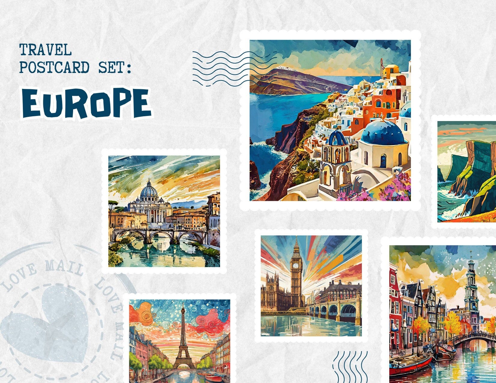
Now, if you really want to see why I don’t think there are big, modern buildings in Europe, here are some pictures of cities in Europe to compare to that picture of Auckland above:

What you shall notice is: there are no construction cones. However, this is not a phenomenon unique to Europe. My dad always states that basically, he lived in Oklahoma instead of New York or California because it’s 12x more expensive to live there, which is a good reason. Here’s what New York and California look like, compared to European cities and Auckland:


Now you shall have noticed that the difference between Auckland and all these other cities is Auckland is full of construction cones. People do jokingly call Auckland “City of Cones” on the Internet, despite the official moniker being City of Sails, not City of Cones. However, I don’t know why I should care about the construction cones, and that doesn’t really dissuade me from heavily considering moving there at all, mostly because I heard Australia trashed out their university system (though hopefully they can recover it) and New Zealand really wants you to come for a few years and start a business, in addition to famously having a near-identical culture, yet the university system doesn’t seem trashed out even if it doesn’t have quite the reputation.
Auckland: City of cones, cranes, and congestion . . . and an exciting transformation - NZ Herald
A walking view of Auckland, featuring, yes, the cones, but clearly showing the positives of living in Auckland without being super curated or artificially airbrushed either:
Someone who’s frothing at the mouth over the cones in Auckland, New Zealand:
Clearly, there are so many cones in Auckland because they are building a lot of things. Am I supposed to think they’re not supposed to build things so there won’t be cones? Then I considered, yes, that’s exactly what many people in major world cities think. Most of Europe is frozen in the 1920s and most big American cities are frozen in the 1950s precisely so people can take all those postcard-perfect pictures and not have construction cones, because apparently LARPing life a century ago for 12x the cost of living in Oklahoma or 6x the cost of living in New Zealand is better than orange reflective pieces of plastic being on the ground in various places at various times.


Auckland is relatively young, growing fast, and obviously needs the construction. I actually do see construction cones all over Oklahoma too, so the construction cones in Auckland didn’t even stand out to me that much, much less bother me, but it did make me consider why there are cones and why some people would think cones are just heresy and blasphemy. The fact is everywhere should have cones, not just younger places that are undergoing a lot of development, but people freeze the cities at some arbitrary historical level just so there won’t be any more construction so they can take a bunch of pictures in front of it, that’s literally it. It’s all basically “society of the spectacle” stuff. (Unlike Guy DeBord, I don’t think consumerism and capitalism are the same. Capitalism isn’t perfect, as in it isn’t finished, but I just see it as something transitional, rather than something evil. I’m not a communist, even if I think this analysis is mostly spot on.)
In the context of New Zealand, I joked that construction cones made orange mana, and there really is something to that idea, even if of course it’s not actually some kind of color magic like the mana colors in Magic: the Gathering but combined with the actual Polynesian/Māori idea of mana. Since Oklahoma is also a cheaper place to live than big US cities and people give it flak too, I thought that orange mana from orange/yellow construction artifacts like traffic cones just kept the douchebags away. Since, for example, Elon Musk actually doesn’t put up any safety signs or tape in his Tesla factories because he famously “doesn’t like the color yellow,” I thought, yes, there’s definitely something psychologically to orange and fluorescent yellow colors keeping douchebags away. I thought, thank God for cones, all the best places seem to be full of cones, because cones are authentic and futuristic and annoying idiots apparently like to froth at the mouth over them instead of thinking it’s cool to watch what’s being built.
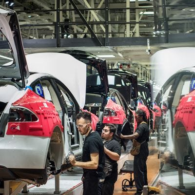
Tesla Workers Getting Hurt Because Elon Musk Hates Yellow
Among the more baffling details in the report are several sections about how Elon Musk’s personal tastes appear to have affected the factory’s safety for the worse, “his preferences … were well known and led to cutting back on those standard safety signals.” Musk, apparently, really hates the color yellow. So instead of using the aforementioned hue, lane lines on the factory floor are painted in shades of gray. (Tesla denies this and sent Reveal photos of “rails and posts” painted yellow in the factory.) He also is not into having “too many signs” or the beeping sound forklifts make in reverse. All things that would seem, uh, important to keeping staff safe. “It’s just a matter of time before somebody gets killed,” a former safety lead said of the conditions in the factory. One employee attempted to call attention to these problems before eventually resigning:
A few months into her job, White became so alarmed that she wrote to a human resources manager that “the risk of injury is too high. People are getting hurt every day and near-hit incidents where people are getting almost crushed or hit by cars is unacceptable.” […]
In her March 2017 resignation letter, White recounted the time she told her boss, Seth Woody, “that the plant layout was extremely dangerous to pedestrians.” Woody, head of the safety team, told her “that Elon didn’t want signs, anything yellow (like caution tape) or to wear safety shoes in the plant” and acknowledged it “was a mess,” she wrote.
Three former SpaceX supervisors told Reuters that Musk would have machinery painted in industrial safety yellow repainted to black or blue because of he didn't like how it looked. The ex-supervisors also said that some workers were told not to wear yellow safety vests when Musk was on site.
The investigation by Reuters found that SpaceX has had at least 600 previously unreported worker injuries since 2014, including eight accidents that led to amputations.
SpaceX did not immediately respond to a request for comment by Insider on Friday.
Reuters' report comes after some SpaceX employees wrote an open letter last year criticizing Musk's behavior as a "source of distraction and embarrassment."
I also heard repeatedly the machines were named after X-Men characters, which I thought was extra ironic, because… didn’t X-Men characters originally all wear a bunch of yellow? Maybe if he made the machines look like that… but no, yellow/orange (these shades of orange are what used to be called “red-yellow” as opposed to “yellow-red” meaning vermillion types of colors) is the color of mana which repels douchebags and Elon Musk is a douchebag, so he can’t have that.


If we want to make Elon and Thiel go back to South Africa, I do recommend we all dress like a bunch of traffic guards and Bob the Builder, since apparently they can’t stand that. That’s their weakness, just like crosses, garlic, and holy water for vampires. They can’t enter any site designated with construction cones, warning signs, or anything else similarly-colored, because that is the weakness of the curse they have. Also, why am I having to defend sports and construction within the span of a week? Shouldn’t the super manly men and real tomboys be doing that, not me? Consumerism has completely destroyed stereotypical masculinity in America at this point, even though it’s not like feminine or neutral-acting people should be embracing this either.


I Hate the Super Bowl

The Super Bowl is everything wrong with American culture. I don’t even categorically hate America: America looks good on paper. Land of the free, home of the brave, justice and liberty, Bill of Rights, America the Beautiful, God Bless America. However, the Super Bowl is basically just an excuse to get people to watch commercials, and the way the militar…

 : r/magicTCG")
I have created the orange mana symbol so we can use it to keep away all the douchebags who just froth at the mouth over bright yellow, orange, construction, safety, etc. symbols. If anyone wants to march through the streets wearing safety gear and hallowing all the ground as a construction site or just a caution site with signs and cones, they can use it. I want to use it, it’s hilarious. Let’s make the losers go back to Africa, and keep douchebags out of places where they’re already relatively less concentrated.

This should be us, marching through the streets, all decked out in yellow and orange with yellow and orange signs and tape everywhere, drop some extra cones on the ground, and just all-around ward the place against the spectacle-vampires who are taking over our countries. In lieu of that, we can just move I guess, since people should be doing that anyway, due to that fact no one place has everything, and that’s how it’s supposed to be.
Goethe on the Psychology of Color and Emotion – The Marginalian
YELLOW
This is the color nearest the light. It appears on the slightest mitigation of light, whether by semi-transparent mediums or faint reflection from white surfaces. In prismatic experiments it extends itself alone and widely in the light space, and while the two poles remain separated from each other, before it mixes with blue to produce green it is to be seen in its utmost purity and beauty. How the chemical yellow develops itself in and upon the white, has been circumstantially described in its proper place.
In its highest purity it always carries with it the nature of brightness, and has a serene, gay, softly exciting character.
State is agreeable and gladdening, and in its utmost power is serene and noble, it is, on the other hand, extremely liable to contamination, and produces a very disagreeable effect if it is sullied, or in some degree tends to the minus side. Thus, the color of sulphur, which inclines to green, has a something unpleasant in it.
When a yellow color is communicated to dull and coarse surfaces, such as common cloth, felt, or the like, on which it does not appear with full energy, the disagreeable effect alluded to is apparent. By a slight and scarcely perceptible change, the beautiful impression of fire and gold is transformed into one not undeserving the epithet foul; and the color of honour and joy reversed to that of ignominy and aversion. To this impression the yellow hats of bankrupts and the yellow circles on the mantles of Jews, may have owed their origin.
RED-YELLOW
As no color can be considered as stationary, so we can very easily augment yellow into reddish by condensing or darkening it. The color increases in energy, and appears in red-yellow more powerful and splendid.
All that we have said of yellow is applicable here, in a higher degree. The red-yellow gives an impression of warmth and gladness, since it represents the hue of the intenser glow of fire.
What Color Is the Sacred? by Michael Taussig, an excerpt
To equate calor with color as did Isidore of Seville detaches us from a purely visual approach to vision and makes color the cutting edge of such a shift. Color vision becomes less a retinal and more a total bodily activity to the fairytale extent that in looking at something, we may even pass into the image. Three of my favorite authors relish this power of color: Walter Benjamin, William Burroughs, and Marcel Proust. They see color as something alive, like an animal, and all three expend considerable verbal talent in getting this across: Benjamin concentrating on the child’s view of color and colored illustrations in early children’s books; Burroughs on drugs, sex, and games with language; Proust on the fullness of involuntary memory transporting one’s body to the event by chance recalled. All of which is to say color comes across here as more a presence than a sign, more a force than a code, and more as calor, which is why, so I believe, John Ruskin declared in his book Modern Painters that “colour is the most sacred element of all visible things.”
This or something like it can be experienced acutely in many non-Western societies, as when an anthropologist casually spoke of indigenous Australians as “color mad” (a compliment), and Ticio Escobar writes of the Chamacoco Indians of Paraguay in the 1980s as obsessed with colors, dyeing , as he puts it, the deepest conceptions of their culture. What does he mean by this arresting statement? What could it mean?
Here colors illuminate the backdrop of myths and set the body alight during ceremonies. Colors “force the object to release hidden meanings, meanings that are neither complete nor lasting, to be sure, but that can gesture, ever so obliquely, to truths that remain otherwise concealed.”
Escobar has a story.
Clemente’s niece Elena is a lovely and vivacious fifteen-year-old. Her proud grandfather assures me that she has shamanic gifts and that she will one day be a great konsaha. For now she sings, maraca in hand, in accompaniment to her teacher. Since Emiliano, the director of the Spanish TV crew, arrived, Elena has not taken her eyes off him. Her gaze is so direct, so natural that the Spaniard, more curious than uncomfortable, asked her one day: “Why do you stare at me like that?” Elena’s dark eyes did not look away from his blue ones. “What is the color of the world to you?” she asked him. “The same as it is for you, of course,” he answered. And she then said something to which he had no reply: “And how do you know what the color of the world is to me?”
That night we spoke of the Chamacoco obsession with colors. Emiliano, who remained silent the rest of that day, only commented that Elena’s answer had Kantian overtones.Or listen to Victor Turner who, on the basis of his time among Ndembu-speaking people in central Africa in the 1950s found that their three primary colors, white, black, and red, were “conceived as rivers of power flowing from a common source in God and permeating the whole world of sensory phenomena with their specific qualities.” And he went on to say that these colors “are thought to tinge the moral and social life of mankind with their peculiar efficacies.”
But first he has to clear some ground.
The hypothesis I am putting forward here is that magico-religious ideas of a certain kind were responsible for the selection of the basic color triad and for the assiduity with which its constituent colors were sought or prepared. It is not the rarity of the pigments that makes them prized but the fact that they are prized for magic-religious reasons that makes men overcome all kinds of difficulties to obtain or manufacture them. I could cite much evidence to demonstrate the quite extraordinary lengths to which societies will go to get red or black or white pigments.
These colors are alive. As mysteries they are invoked in the seclusion of cults concerned with death and with the passage from adolescence to adulthood. In the funerary cult, boys and girls witnessed the priest dig a trench in the form of a cross, evoking sexual intercourse. Along the cross he placed antelope horns containing medicine, and filled the trench with water tinged red from a beheaded fowl, singing, “This is no ordinary river. God made it long ago. It is the river of God.” Posing riddles when all three rivers of power, white, black, and red, were finished, the priest sang songs with archaic and bizarre terms.

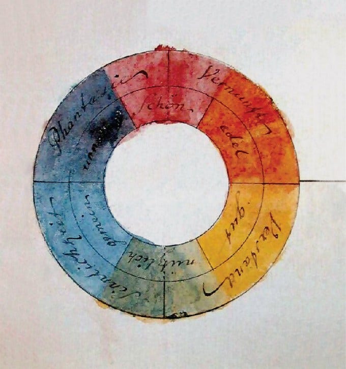
Goethe's original proposal was "to marvel at color's occurrences and meanings, to admire and, if possible, to uncover color's secrets" (Norman,49). To Goethe it was most important to understand human reaction to color, and his research marks the beginning of modern color psycology. He believed that his triangle was a diagram of the human mind and he linked each color with certain emotions. For example, Goethe associated blue with understanding and believed it evoked a quiet mood, while he believed that red evoked a festive mood and was suggestive of imagination. He choose the primaries red, yellow and blue based on their emotional content, as well as on physical grounds, and he grouped the different subsections of the triangle by 'elements' of emotion as well as by mixing level. This emotional aspect of the arrangement of the triangle reflects Goethe's concern that the emotional content of each color be taken into account by artists.
Within the context of Goethe's triangle, we find an excellent model for studying different color relationships, as well as for demonstrating some of the fundamental differences between electronic color and pigment (i.e.: additive vs. subtractive color mixing). An interactive triangle on the computer allows a simulation of these differences.
People also seem to project the idea of the color orange onto the fruit, oranges, a lot, and think of it as like “Annoying Orange,” even though I think of oranges as sophisticated, like the common slang “apples from China” that exists in many European languages as well as Leonard Cohen’s song Suzanne. (Ironically, actual apples are mostly from China.) I have definitely been drinking some Constant Comment tea (“she feeds you tea and oranges that come all the way from China”) while writing this to maximize my orange mana.
Last but not least, I keep thinking about how all the places that keep drawing attention to themselves and aren’t very practically designed are going to get nuked and not have anywhere safe to hide, so the idea of destruction also relates to my associations around “orange mana.” The wildfires in California etc. also fit that. When people just make these sort of taxidermied places, orange destroys them, but when people let the orange mana flow, orange builds them up.


The firefighters are also wearing a lot of yellow and orange safety gear while running into the orange California fire.
So, forget “global warming,” I declare a Global Oranging, you are with us or you are against us.

